Required Software
- Adobe Photoshop
- Adobe XD

Introduction
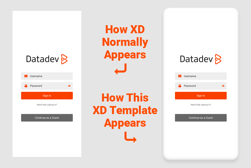
I created an Adobe XD phone mockup template so my presentations look more like a phone than a vertical rectangle. This makes the client’s experience more realistic and pleasing, and I thought others might be able to use the files in a similar fashion.
There may be other ways of producing a mockup like this. If that’s the case, I’d like to hear about it. I know the phone could be created as one or more vector files, and that might be the optimal solution. But this is a very easy way to improve the appearance of a phone presentation, and I’ve made the files free to download for anyone.
I created a fake app name and interface so it looks realistic as far as how an actual XD presentation might appear, but everything in it is just filler. Any actual company or app with this name or services similar to these is purely accidental. The most important layer group called “Phone” is located above all other layers, and that’s really the one you would need. Everything else could be deleted and then re-created.
Description
The Photoshop file’s guides are organized so the layer contents can be divided into eight overlapping graphics. I did this because a single phone mockup with transparency in the middle does not work, though that may change in the future. At the time I created this post, XD did not recognize the ability to click though the middle of the phone even though that space is transparent. For instance, when your phone mockup is in the top layer in your XD file—it has to be when there are curved corners—XD would not allow users to click anything that has been designed in the interface such as buttons, logos, icons, etc.
But if you use individual pieces such as a top graphic, bottom graphic and side graphics, there’s no central transparent space where your design will go. You will essentially have a phone “border” that allows for the creation of phone layouts in the middle of your XD artboard. The dimensions of my files are noted below, but you could create any resolution with a bit of effort.
- Dimensions of Phone Screen: 1,280px wide X 2,700px high
- Dimensions of Phone Frame Mockup: 1,800px wide X 3,200px high
Why 8 Graphics Instead of 4?
When I originally created the layout with top, bottom and side graphics and inserted them in the Adobe XD phone mockup, I noticed that XD was showing some very small gaps here and there when I zoomed in and out. So I cut out additional square, phone corner graphics and laid them over the appropriate locations in order to ensure no gaps appeared. The result is a set of four side phone graphics and four small, square corner graphics.

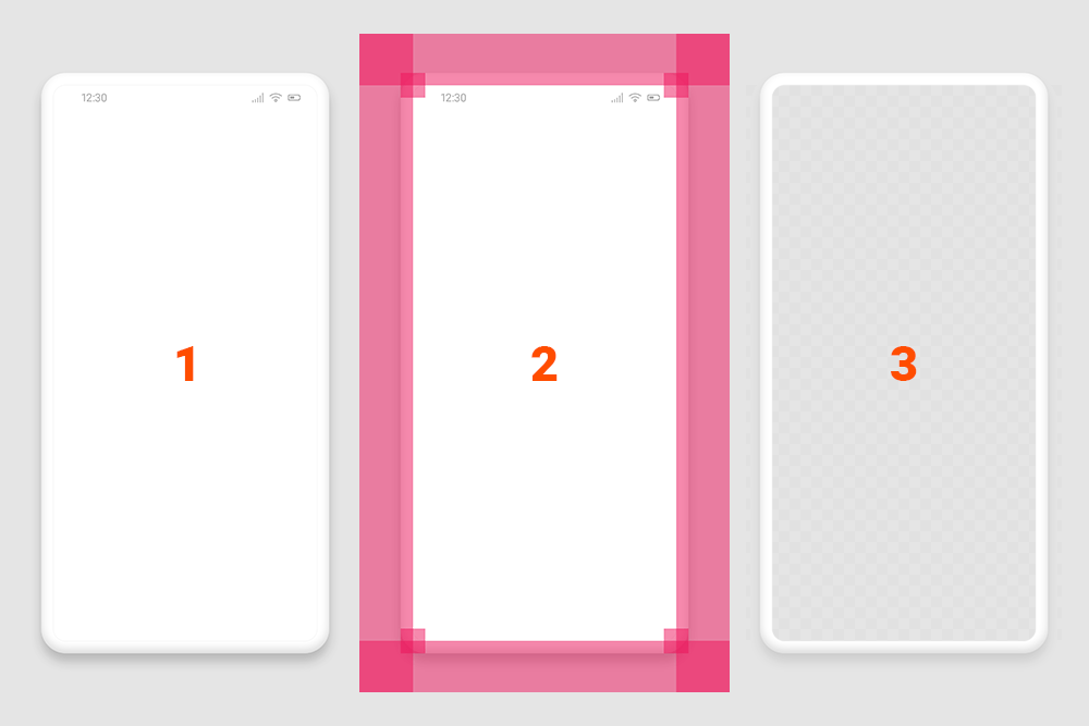
Photoshop Layer Groups
- The individual phone elements
- Overlapping shapes to show where selections are made
- The final phone frame with the middle cut out
Download Files (Link Below)
Photoshop Template
- Contains the initial phone mockup elements in layers.
- Incorporates overlapping rectangle/square colors to show how the selections/cuts were made.
- Contains the final phone with the middle cut out.
- File Name: Adobe-XD-Phone-Template-1280×2700.psd
Sample XD File
- Shows the Photoshop phone template in use in an XD file.
- Shows how scrolling works inside the phone mockup frame.
- File Name: Adobe-XD-Phone-Template-1280×2700.xd
Contact the Author
Please feel free to contact me. If you have a useful question or comment, I’ll add it here with my thoughts as appropriate, though I will never post your name or email address.
Bill Adams
[email protected]


